Textbook Redesign Project
The Context
Historically, our textbooks have been designed by our editorial services vendors and were severely limited due to their lack of proximity to our code structure, capabilities, and evolving products (courseware and web view). Our original CNXML (OpenStax CNX’s XML) to XHTML to PDF pipeline was also incredibly clunky and in desperate need of streamlining and updating. We took this opportunity to refactor the styling and redesign all of our titles.
The Challenge
OpenStax at this time had about 35 titles in its library with another 10 releasing that year. We were also on the cusp of securing funding for our book blowout project which would eventually add 40 more titles over the next five years. The time was critical to get all of the books to a standardized content mark-up and design state so that we could reduce the future maintenance burden and streamline our textbook output process.
Guiding Principles
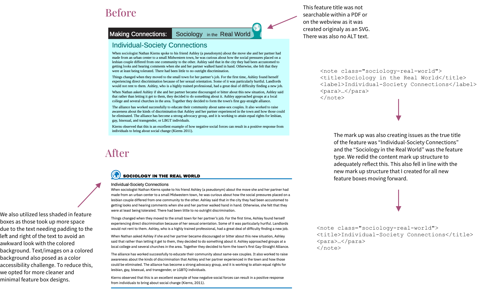
Accessibility - WCAG 2.0 (Level AA) could be easily achievable with careful color palette selection and font size selection.
Page savings - due to the free-flowing content and autogenerated PDF nature of our product, it was important to approach a design that saved the most space. Fewer pages for a printed product meant lower cost for our students who might buy the book.
Reducing Redundancy and Exceptions - the CNXML to XHTML to PDF pipeline was riddled with ad-hoc solutions for one-off requests throughout the years. CNXML tagging for similar features was also slightly different which caused confusion with maintenance and for content ingestion for our courseware and partner products.
Standardization - my philosophy is that feature boxes, learning objectives, table of contents, etc. at their core have only a few major designs. It was imperative to reduce the amount of “extra” design elements so that we could keep a consistent look throughout our library which would ease regression testing burdens.
The Approach
Gathered all feedback for our PDFs and web view content from our errata tool, surveys, and customer support logs. Identified some common areas that needed improvements such as accessibility, readability, and general design issues.
I cataloged all repetitive items within each of the existing textbooks and their templates. Repetitive items were defined as, anything that appeared across the library (preface, chapter/module titles, text, etc.) and anything that required a class to either manipulate the structure and/or add styling (styled feature boxes that have an injected title, collated elements, etc.).
I worked with a designer to create 4 themes for our titles. The themes included a color palette, common feature styling, any icon assets, font styles and font sizing/scale.
Theme 1 would be mostly for long, text-heavy titles. Notable features for this are the 2 column layouts for space savings and a readable font. (Example: University Physics series)
Theme 2 would also be for text-heavy titles but had a more classic look and warmer color palette common for social sciences titles. This is the sister theme to Theme 1. (Example: Introduction to Sociology 3e)
Theme 3 is the most compact and extreme for space savings. This design was critical for space savings for our math titles which have a lot of examples and exercises. (Example: College Algebra with Corequisite Support).
Theme 4 is the sister theme to Theme 3, but less extreme with the space savings and gives more breathability to the content. (Example: Astronomy)
I then worked with our Editorial Director to assign our existing titles to separate themes and to ensure that no pedagogically significant designs are lost or deprioritized. Any book that also started its design and market research phase at this time would also be assigned a theme. Depending on when books would be published this directed the timeline for the completion of each theme.
A challenge that came up during this stage of the process was how to distill this information to my team. A book is comprised of at least 20 different parts, all needing styling. After much trial and error, my team found a good process for how to incorporate the robust acceptance criteria into their workflow. This is the current template for how to add a title to a theme.
Following this new template for adding a title. Our velocity for refactoring increased as it was really easy for me to organize each book and standardize each piece. If major content changes were needed, I worked closely with our content managers to implement book-wide mark-up changes.
The Result
We now have a new and robust library of style elements that meet WCAG 2.0 accessibility standards for visual and markup design, styling consistency, and efficiency for future book and assessment production. Efforts reduced the complexity of the design library. We also built a set of documentation and guidelines for our vendors based on our new design system. I am also confident that this can scale with our growing library.
A Closer Look
Looking Ahead
I hope that my team, with our backend content delivery team, creates a way to package the styles with the XHTML so that our courseware, web-view, and partners can ingest not only the content but with their intended pedagogical styling. With the standardization of our mark-up structure and designs, I also hope to be able to have our content validation be more robust within the CNXML editor that matches with what our styling structure would expect. From there, hopefully, we can create a GUI that makes it easy for non-developers to design their own features by choosing their own colors and icons. In terms of accessibility, I also hope to start implementing more accessible XHTML that can be embedded into our PDFs so that they can be read by screen readers without the need of using an expensive one-time tagging service.